SE/30 Forever
< Back to homeDesign and packaging
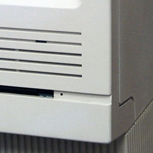
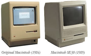
The SE/30 shares its case design with the SE, a model introduced two years earlier. There are only a few key differences between the two, the SE/30 does not have a secondary floppy drive slot on the front.
The SE and SE/30 were designed by Frog Design, a design agency used by Apple from 1984 to 1990. Hartmut Esslinger created the Snow White design language, used across Apple's product range during this period. Apple spent the latter part of the 90s attemptign to move on from the Snow White design language.
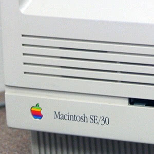
The SE/30 is not beige. It is a warm grey platinum color. Esslinger disliked the beige color used for the Apple II, III, Lisa and original Macintosh. So an off white color was used instead. In PANTONE's color system, the color used for the SE/30 is probably closest to 420 or 421. According to Apple, "Apple does not normally use PMS color charts or Pantone color numbers to designate the platinum color that is now the company standard. Our platinum color number on a coded PMS chart is somewhere between 420 and 421, somewhat closer to 421. (This depends on the age of the chart and the light source used for viewing it.)"
The overall design gave the SE and SE/30 a colder, more professional and utilitarian look than the original Macintosh. The front bezel has a slight outward curve which prevents it from appearing completely flat.
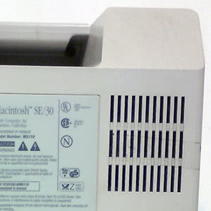
The signature chamfers used by Jerry Manock in the original Macintosh design were replaced with 3 mm curves, and the chiseled styling around the floppy drive slot was removed. The floppy slot is part of a recessed area on the front bezel. Vertical lines surround the base of the machine, providing cooling vents. Additional cooling is provided by vents on the back of the machine.
A Macintosh SE/30 was gifted to the SFMOMA collection by Miranda Leonard and Jan Pridmore in 2012.
The Peter Norton Family Foundation (yes, that Norton, the one that fixes your unhappy Mac) also donated a Macintosh SE/30 to the MoMA in New York.
Packaging
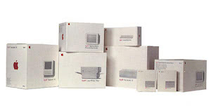
Above: Example of range of boxed Apple products, 1987
The SE/30's packaging can be described as utilitarian but also beautiful at the same time. Sometimes, less is more.
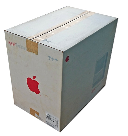
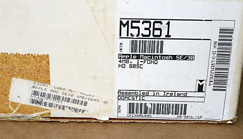
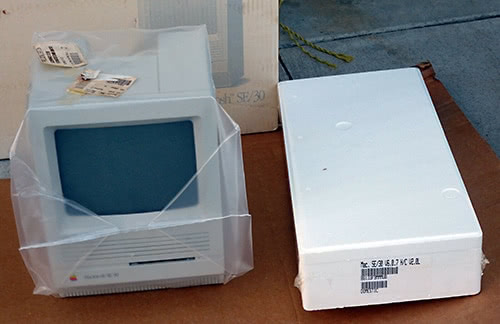
The SE/30 was packaged in a white cardboard box, with red Apple logo and printed lettering in Apple Garamond font. Inner boxes were in styrofoam packaging. The SE/30 itself was wrapped in sealed transparent plastic. The model and serial number were printed on white labels, on the outside of the box and on stickers on the inside.
A greyscale photo of the SE/30 appears on the side of the box. Apple stopped using full color packaging after the early Plus models. Colour packaging wouldn't return until the mid-late 90s.

Printed materials and original disks
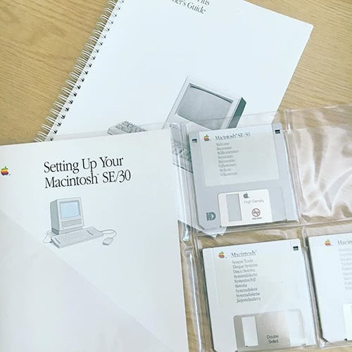
Bundled with the SE/30, were the following printed materials and disks.
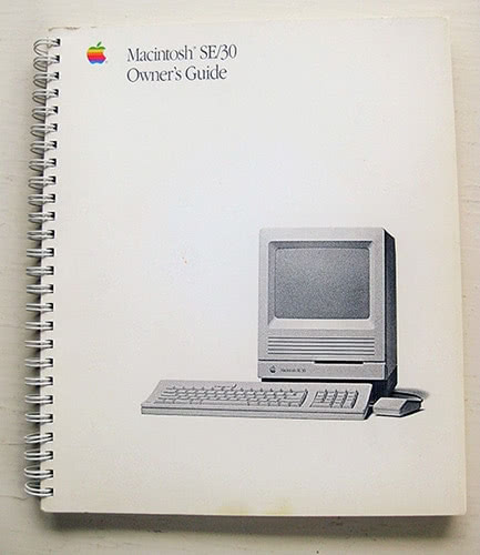
- Macintosh SE/30 Owner's Guide (pdf)
- Setting Up Your Macintosh SE/30
- Macintosh SE/30 Special Options and Technical Information
- "Open me first" wallet containing disks
- Warranty sheet
- Packing list